Formatting a book. It sounds so technical, doesn't it? One part of you is probably thinking about the perfect trim size, margins, and typography for a physical, printed copy you can hold in your hands. The other part is trying to figure out this mysterious thing called a reflowable EPUB file for ebooks. The whole point, my friend, is to make the reading experience feel so natural, so seamless, that the reader forgets they're even reading. They're just lost in your world.
Your Book Deserves to Look as Good as It Reads
You did it. After all that work wrestling your story, your expertise, or your family’s legacy onto the page, it’s finally written. You’ve poured your heart, soul, and a truly concerning amount of coffee into this thing. Congratulations, author. That is no small thing.
Now comes the part that can feel like the final boss battle of self publishing: formatting. Let's be honest, it can sometimes feel as frustrating as trying to fold a fitted sheet in the dark. But getting these details right is what transforms a manuscript from something that feels homemade into a book that looks like a timeless treasure on a bookstore shelf.
This is the moment your words get to put on their Sunday best. You’re not just creating a file; you’re creating a physical object, something designed to last. That permanence is beautiful, and we're here to make sure your book’s presentation truly honors the work you put into it.
Print vs Ebook A Tale of Two Formats
Before you start messing with fonts and margins in your document, it’s critical to understand that formatting a print book and an ebook are two completely different animals. Think of one as a painting, fixed and permanent, and the other as a river, fluid and adaptable. I'm not trying to be poetic; it's genuinely the best way to think about it.
-
Print Formatting Is All About Control: For a printed book, you are the architect. You dictate the exact page size, the width of the margins, and precisely where every single line breaks. The reader’s experience is static and has been carefully curated by you.
-
Ebook Formatting Is All About Flexibility: For an ebook, you have to let go of most of that control. The reader is in the driver's seat. They choose the font, the text size, and even the background color. Your job is to create a "reflowable" document that looks fantastic on everything from a tiny phone screen to a large tablet.
You’ve created something that will outlast you, a piece of your heart that someone can hold in their hands. That’s a beautiful, powerful thing. Don't let the technical details diminish that accomplishment.
Here's a quick look at the key differences you'll need to consider when formatting for a physical book versus a digital one.
Quick Formatting Checklist Print vs Ebook
| Formatting Element | Print Book Focus | Ebook Focus |
|---|---|---|
| Page Size | Fixed (e.g., 6×9, 5.5×8.5 inches) | Not applicable (reflowable) |
| Margins | Crucial (Gutter, inside/outside margins) | Minimal (handled by the e-reader) |
| Fonts | Serif for body (e.g., Garamond), embed fonts | Reader-selectable, use standard fonts |
| Page Numbers | Essential (headers/footers) | Not used (flow depends on font size) |
| Images | High-resolution (300 DPI, CMYK color) | Screen-resolution (72-150 DPI, RGB color) |
| Table of Contents | Static page numbers | Hyperlinked, clickable text |
| File Type | PDF (Print-Ready) | EPUB or MOBI |
Understanding this distinction from the very beginning will save you a world of headaches down the road. You can't just save your print file as an ebook and call it a day. It'd be like trying to nail soup to a wall. You need two separate approaches for two unique reading experiences.
And honestly, if this already sounds like a chore, remember that this is a perfect place to bring in a professional. A skilled formatter or a full-service ghostwriter can handle the technical side, leaving you free to focus on what you do best. It's still your vision, just with an expert co-pilot helping you navigate.
Building Your Book's Foundation
Before we get to the fun stuff like picking fonts and designing chapter headings, we have to pour the concrete. Getting these initial settings right is the unglamorous but absolutely critical first step. Trust me, if you mess this part up, you’ll be tearing down the whole house and starting over later. It's a headache you don't need.
Think of this as building the digital scaffolding for your book. For a print book, we need to lock in three key elements: trim size, margins, and bleed. Nail these now, and everything else will fall into place so much more easily down the road.
Honestly, this is the kind of detail work that can make your eyes glaze over. It’s also the kind of tedious, click-this-then-that task that a professional ghostwriter or formatter secretly enjoys. Handing this part off lets you stay focused on the heart of your project, the story, while they handle the architecture. It's not cheating; it's just smart.
What Is Trim Size and Why Does It Matter?
Your book's trim size is simply its final, physical dimension once the printer trims the pages. It’s the length and width of the book someone will actually hold in their hands.
Different trim sizes create different feelings. A 5 x 8 inch book feels intimate and easy to carry, perfect for a short memoir or a collection of personal essays. A 6 x 9 inch book, on the other hand, is the workhorse of the publishing world. It's a standard for both fiction and non fiction that feels substantial and professional.
Choosing your trim size is one of the very first decisions you have to make because it dictates every other measurement in your manuscript file. You can't just change it halfway through without throwing your entire layout into chaos.
A book is a physical promise. The weight of it, the size of it in your reader’s hands, it’s all part of the story you're telling before they even read the first word.
So, how do you set it?
-
In Microsoft Word: Pop over to the
Layouttab, clickSize, and then chooseMore Paper Sizes. This is where you can type in your custom dimensions, like 6 inches for width and 9 inches for height. -
In Google Docs: This one's a bit less direct, as custom sizes aren't a native feature. The easiest workaround is using an add on like "Page Sizer" or, even better, setting up your document correctly in Word first and then uploading it to Google Docs.
Setting Your Margins for Readability
Margins are the blank spaces framing your text on the page. They're the unsung heroes of good book design, giving your words room to breathe and stopping them from getting lost in the "gutter," the deep crease where the pages meet in the binding.
A book with skimpy margins just feels cramped and stressful to read. You need an inside margin (the gutter) that’s wide enough to prevent the text from being swallowed by the binding. For a standard 6×9 paperback, a good rule of thumb is at least 0.75 inches for that inside margin.
The outside, top, and bottom margins can be a little smaller, usually somewhere between 0.5 and 0.75 inches. These settings create a balanced, professional looking page that feels inviting instead of overwhelming.
To Bleed or Not to Bleed
I promise this sounds more dramatic than it is. Bleed is just a printing term for when you have images, graphics, or colored backgrounds that need to run all the way to the edge of the page, with no white border.
To pull this off, you actually have to design the image to extend beyond the final trim line. The printer then trims the page down to its final size, slicing off that tiny extra bit. This ensures your color or image goes perfectly to the edge.
- Full Bleed: If you want an image to cover the entire page, you’ll need to extend it 0.125 inches past the trim line on the three outer edges (top, bottom, and outside).
- No Bleed: If your book is all text, you can completely ignore this. Just leave the bleed settings at zero and move on. Phew.
Getting these three pieces, trim size, margins, and bleed, set up correctly from the very start is the single best thing you can do to learn how to format a book without tears and frustration. It’s the boring part that makes all the beautiful parts possible.
Choosing Fonts and Styles That Tell Your Story

If your book's structure is its skeleton, then your typography, the fonts and styles you choose, is its voice. Before a reader even deciphers a single word, the font is whispering to them, setting a mood. It can feel warm and classic, crisp and modern, or serious and academic.
Choosing your font is a bigger deal than you might think. It's not just about picking something that looks pretty; you're building an effortless reading experience. The ultimate goal is for the design to become so seamless that it’s invisible, letting your story or ideas take center stage.
I know this is where many authors start to feel a little overwhelmed. The sheer number of choices can be paralyzing. It's one of those spots where leaning on a professional ghostwriter or designer can be a real game changer. They’ve spent years figuring out what works, so they can help you find that perfect voice for your pages while you stay focused on the words.
The Great Debate: Serif vs. Sans Serif
Let's dive into the classic showdown in the font world. Getting this one difference down is the first real step in knowing how to format a book with intention.
-
Serif Fonts: These are the ones with the little "feet" or tails on the ends of the letters. Think Times New Roman, Garamond, or Baskerville. Those little feet do more than just look traditional; they create a strong visual line that guides the eye, making them incredibly easy to read for long stretches. For the main body text in a print book, a good serif font is almost always the right call. It's classic for a reason.
-
Sans-Serif Fonts: "Sans" is just French for "without," so these fonts lack the little feet. Familiar faces here are Arial, Helvetica, and Calibri. They give off a clean, modern, and often more casual vibe. I find they work brilliantly for headings, subheadings, and captions, creating a nice, clean contrast with the main text.
Your font choice sets the mood. A classic serif like Garamond feels like settling into an old leather armchair with a cup of tea. A clean sans-serif like Helvetica feels like a bright, minimalist coffee shop. Choose the atmosphere that fits your story.
Finding the Right Size and Spacing
Once you've landed on your fonts, the next job is to dial in the size and spacing for maximum readability. Nobody wants to squint their way through 300 pages. The goal here is comfort. You want the text to feel inviting, not like a dense, impenetrable wall.
Big publishers have this down to a science. They use standardized templates to control production costs and ensure consistency across a global market that’s projected to hit $142.7 billion by 2025. A common setup you'll see from them is a serif body font set between 10 and 12 points, with line spacing between 1.15 and 1.5. This creates that perfectly balanced, readable page. For a deeper dive, it's worth learning more about the publishing world and its standards.
Here are the key settings I always tell my clients to focus on:
-
Body Text Font Size: For a print book, anywhere between 10pt and 12pt is the sweet spot. Anything smaller is a strain on the eyes, and anything larger can feel a bit like a children’s book (unless, of course, that's what you're writing!).
-
Line Spacing (Leading): This is the vertical space between your lines of text. Whatever you do, don't leave it on the default "single" spacing. Bumping it up to 1.25x or 1.5x is a simple tweak that gives your words room to breathe and dramatically improves the reading experience.
-
Chapter Titles and Headings: These should be noticeably larger and are the perfect place to use that contrasting sans-serif font. A chapter title might look great at 18-24pt, while a subheading within the chapter could be 14-16pt and bolded for emphasis.
My best pro tip? Create and apply "styles" in your word processor for each of these elements (e.g., a "Body Text" style, a "Chapter Title" style). A little bit of setup work upfront will save you a massive amount of time later and guarantee your book looks polished from the first page to the last.
Getting Your Book’s Front and Back Matter Just Right
So, you’ve poured your heart and soul into the chapters. The core message is there, the story is told. But a book isn't just the chapters, is it? The pages that come before and after, the front and back matter, are what wrap your work in a professional package. Think of them as the warm handshake and the fond farewell that frame the whole experience.
Getting this right is a huge piece of the puzzle when you're learning how to format a book. These aren't just filler pages; they're time honored traditions that readers expect to see. They give your book structure, lend it credibility, and create a home for all the important bits that don't quite fit into the narrative. It’s what transforms a stack of pages into a real, honest to goodness book.
I know what you're thinking. You just finished the marathon of writing, and now I'm hitting you with more to do. Don't worry. This part is less about wrestling with your creative muse and more like setting the table for a fantastic dinner party. It’s all about presentation.
The Front Matter: Your Book's First Impression
This is everything your reader encounters before they hit Chapter One. Each element has a specific job and a traditional place in the lineup. Let's walk through it, from the very first page inward.
- The Title Page: Keep it simple and elegant. This page needs just three things: your book's full title, the subtitle, and your name as the author. That's it. No flashy graphics or long descriptions.
- The Copyright Page: This is where you officially plant your flag. Found on the back of the title page, it holds your copyright notice (like © 2024 Jane Doe), your publisher’s details, and your ISBN. You might also include a disclaimer here, such as noting that names have been changed in a memoir.
- The Dedication: This one is my favorite. It’s a short, heartfelt tribute to someone who inspired you or held you up during this wild journey. It can be as simple as "For Mom," and it adds a beautiful, personal touch.
- The Table of Contents (TOC): For a nonfiction book, a TOC is non negotiable. It's the reader's roadmap. In fiction, it’s often simpler, just listing chapter numbers or titles. For print, you'll need page numbers; for an ebook, these entries absolutely must be hyperlinked.
Piecing these pages together can feel a bit fussy, making sure everything lands correctly. Honestly, this is one of those spots where handing things over to a pro brings so much peace of mind. A seasoned ghostwriter or formatter lives and breathes this stuff, so they can get it all lined up perfectly while you take a well deserved nap.
A well-crafted front matter doesn't just introduce your book; it shows respect for the reader. It’s a quiet promise that you’ve thought about their experience from the very first page.
The Back Matter: A Graceful Exit
After your reader turns that final page of the last chapter, the back matter gives them a place to land softly. It's your space to add context, show gratitude, and offer a little more insight into you and your work.
Here’s what you’ll typically find tucked away at the end:
- Acknowledgements: While the dedication is usually for one or two key people, this is where you can thank your entire support crew. Your editor, your family, the barista who knew your coffee order by heart, anyone who helped you get across that finish line.
- About the Author: This is your chance to connect with readers on a more personal level. Write a brief, engaging bio that tells them who you are. And definitely include a link to your website or social media so they can keep up with you!
- Appendix or Endnotes: This section is mostly a nonfiction thing. If you have charts, data, or other supplementary material that would have bogged down the main text, this is the perfect place to put it.
- Bibliography or References: If you've cited other research or works in your book, this is where you give credit where credit is due. It’s essential for maintaining your credibility.
Putting these final sections together is the last coat of polish. It’s what turns your manuscript into a complete, professional package. You’ve created something that will last, a piece of yourself that someone can hold in their hands. Taking the time to frame it properly is the final, fitting honor your hard work deserves.
Exporting Your Files for Print and Digital
You did it. You wrestled with every comma, perfected every chapter, and now your manuscript is a polished, beautiful thing. Take a moment. Breathe it in. This is where your story gets its wings and prepares to fly out into the world.
But how do you get it from your word processor into a format that printers and e-readers can actually understand? This is the final technical hurdle, the moment we transform your document into a real book. It can feel a little daunting, but I promise, we can break it down into clear, manageable actions. You’re so close to the finish line.
Print-Ready Means PDF Perfect
For a physical, printed book, the undisputed champion of file formats is the Print-Ready PDF. This isn’t just any old PDF you’d save for an office memo. A Print-Ready PDF is a special kind of file that locks everything in place.
Think of it like taking a photograph of each page. The fonts, the images, the margins, everything is flattened and fixed exactly where you want it. This ensures that what you see on your screen is precisely what the printer will produce. No surprise font changes, no weird spacing issues.
To create one, you'll typically use an option like "Export as PDF" or "Save as PDF" in your software. The key is to look for settings that allow you to:
- Embed all fonts to ensure they travel with the file.
- Set image resolution to a high quality (300 DPI is the standard).
- Include bleed settings if your book has images that go right to the edge of the page.
Getting this PDF right is the final handshake you give the printer. It’s your way of saying, “This is it. This is my book, exactly as I dreamed it.”
Speaking the Language of Ebooks with EPUB
When it comes to ebooks, we have to throw the idea of a fixed page right out the window. The universal format here is the EPUB file.
An EPUB is less like a static document and more like a tiny, self contained website for your book. It's designed to be "reflowable," meaning the text can adapt to any screen size, font, or setting the reader chooses. It's all about giving the reader a comfortable, flexible experience.
This process chart shows the basic building blocks of any book, from the opening pages to the final words.
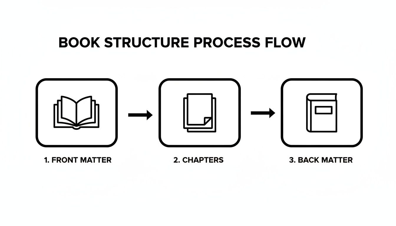
Whether you export to a fixed PDF or a flexible EPUB, these core components must be in the right order for a professional result.
This final export is a profound moment. It’s the digital equivalent of bundling up all those handwritten pages, tying a ribbon around them, and handing them off to be shared with the world. You’re almost there.
The Hidden Magic of Metadata
Behind every great ebook is something you never see: metadata. This is the hidden information that tells online stores everything they need to know about your book.
It includes things like:
- Your book's title
- Your author name
- The publisher
- Your ISBN (the book's unique identifier)
- A short description (the blurb)
This data is absolutely crucial for discoverability. It’s how readers find your book when they’re searching on Amazon or Kobo. Proper metadata is even more important as digital channels grow, with global online book sales projected to hit $26.04 billion in 2025. Following file standards and getting your metadata right directly impacts how visible your book will be in the world’s biggest digital bookstores. You can uncover more about the latest trends in book sales.
Creating these final files can feel like a very technical, impersonal step after such a deeply personal journey of writing. It’s completely okay if this part feels overwhelming. This is a perfect time to tag in a professional formatter or ghostwriter. They live for this stuff. They can handle the technical export, leaving you free to plan your book launch party. It's your vision, brought to life with an expert assist right at the finish line.
Your Book Formatting Questions, Answered
Diving into book formatting can feel like you’ve been handed a map written in a language you don’t quite speak. It's completely normal for questions to pop up, and honestly, it’s a good sign. It means you’re focused on the details that transform a manuscript into a book that feels special in a reader's hands.
You’ve poured your heart into this project. Now, let's clear up some of the most common hurdles authors face. My goal here is to give you straightforward answers so you can move forward with confidence and get that beautiful book out into the world.
Can I Use the Same File for Both Print and Ebook?
Oh, how I wish this was a simple "yes," but the answer is a firm "no." Trying to use one file for both is a bit like trying to use a car key to unlock your front door. They’re both keys, but they're built for entirely different locks.
- Your print file is a static, fixed layout PDF. Think of it like a photograph where every word, margin, and page number is locked into a precise position.
- Your ebook file (usually an EPUB) has to be fluid and "reflowable." It needs to resize and adapt beautifully to a dozen different screen sizes, from a tiny phone to a large tablet, all based on the reader's personal settings.
You'll need to create two separate, properly formatted files. It’s the only way to guarantee your readers have a great experience, no matter how they choose to read your book.
What Software Should I Use to Format My Book?
This is a great question, and the right answer really comes down to your budget and how much of a learning curve you're willing to tackle.
-
Microsoft Word: Believe it or not, you can absolutely format a professional looking book in Microsoft Word. It requires a good bit of patience and a solid understanding of how to use Styles, page breaks, and section breaks, but it’s completely doable with a tool most people already have.
-
Vellum: For Mac users, Vellum is the darling of the self publishing world for a reason. It's incredibly intuitive and creates gorgeous, professional print and ebook files with almost no fuss. It’s an investment, for sure, but countless authors find it’s worth every penny for the time and headaches it saves.
-
Adobe InDesign: This is the professional grade software the big publishing houses use. The learning curve is steep, think Mount Everest, but it gives you unparalleled control over every single design element. It’s total overkill for most authors, but it remains the industry standard.
The best tool for you is the one that doesn't make you want to throw your computer out the window. Your creative energy is a precious resource. Spend it on your story, not on fighting with frustrating software.
Should I Hire a Professional Formatter?
Let me be completely honest. Unless you genuinely enjoy the technical puzzle of formatting or are working with the tightest of budgets, my answer is almost always a resounding yes.
You have just completed the monumental task of writing a book. That is an incredible achievement in itself. The formatting stage, however, is packed with tiny, tedious details that can be maddening if it's not your area of expertise. A single misplaced page break, an improperly embedded font, or a wonky margin can derail the entire process.
Hiring a professional formatter, or working with a ghostwriter who includes it in their services, is an act of self care. It frees you up to focus on marketing, planning your launch, and actually celebrating your accomplishment. You're not giving up control; you're delegating the technical work to ensure your vision is realized perfectly. It’s still your book, your story, your legacy. You’re just letting an expert handle the digital heavy lifting.
At My Book Written, we believe in the profound importance of bringing your story to life. Whether you're just starting to organize your thoughts or you're ready to find the perfect partner to help you cross the finish line, our resources are here to guide you with calm and clarity. Explore how to build the architecture of your book with us.